Recently our team finished the game Sketch Artist and presented it at our final Capstone Presentations.
Below are video links to our presentation and some recorded gameplay!
Link to our presentation
Link to recorded gameplay
Also, here is an image of our final game poster by Katie Freeman, inspired by the art of the Pulp Fiction movie posters.
Sketch Artist
Wednesday, August 17, 2016
Sunday, March 6, 2016
Our Presentation is Over!
We missed this last Thursday's update on the blog, but for a good reason: We had our presentations to see what games might get cut!

Good news though, our game made it! We'll be continuing production on our game until it is complete and eventually published on the Apple apps marketplace. We don't know yet if we'll have any new additions to our art team, but there is a possibility our team might grow! We will find out Monday by the end of the day.
For our presentation, called Vertical Slice, we had to show a slice of the core gameplay of our game with no art allowed, then we had to give a separate art style guide presentation. Our producers and programmers worked long and hard on the gameplay section while our three artists, Katie Freeman, Jose Morales, and Kelly Rodak, worked on the style guide for the game's art. This style guide is what this blog has detailed the production of for the last couple of months!
Our Art Lead Katie Freeman put together the presentation with all of our artists' work in it, and we'd like to share it with everyone! The images below is our style guide for the art of Sketch Artist.
Here's an animation test that our animator, Kelly Rodak, completed with an early version of the rig:
Here's a video example by Katie Freeman showing some of the UI elements moving around in her UI concept art piece before the slides afterward went into great detail:
Here's a gif of the effect in motion:

And that ended our art style guide! For our presentation, we had a Power Point version (with some stuff missing intentionally to keep it shorter) that Katie presented to the audience, and a printed version that was bound with metal rings and handed out to all of our art professors. It was a really tiring and stressful ordeal, but it really paid off in the end and we all feel that we have done our best! Sketch Artist has an amazing team and it will be exciting to see how our game continues to grow all the way up until publishing time!
We will try to continue publishing updates in here, but some content in the future will be withheld with the intention of keeping some stuff a surprise for our players!
Thursday, February 25, 2016
More animation progress for moving graphic!
Kelly has made more progress on our moving graphic for our art presentation! We also have our 2D rig now, so Kelly worked on this in Maya!
Taking a shot at a logo design!
Designing a logo for a game is tough work! It's the image that is going to be the face of our team's hard work, so it's important that it is memorable and represents the game well. (And bonus points if it can be reworked into our app store icon, too!)
Here are designs by both Jose Morales and Katie Freeman for possible logos:
Here are designs by both Jose Morales and Katie Freeman for possible logos:
Fonts!
One thing we had to think about when designing our game was the sort of font we would like to see in the world, whether it be on stuff within the environment or written on a button. Katie Freeman designed two hand-drawn fonts for us to use since we felt it matched the Sketch Artist style! On top of that, we're using an Adobe font called Courier New Bold for the computer screen, which is the font visible in the interface design post on the computer screen concept.
Here are what our custom font designs look like!
This "handwriting" font is just a simple font meant to look like handwriting but still be neat and legible. It will be used for things in the game that are meant to look hand-written, and possibly for any menu stuff. We'll also be using this font in our Art Presentation for our big game presentation day!
This font is meant to be a little stiffer and more formal looking than the handwriting font above while still looking natural and hand-written. It has trouble showing up the inner shading once downloaded and installed though, so we'll have to work out how to fix that error.
This font will be used more for titling and labels. It could also be used within the world on any posters or signs.
Buttons and Interface!
We're getting deeper into the design of our game's many interfaces and buttons and what they'll look like. A lot of our buttons in the game are parts of the environment! Katie Freeman worked on the designs for the buttons and the design for the interfaces.
Let's take a look at our buttons first! Their functionality is briefly mentioned within the images:
Now let's take a look at some of these interfaces within the game!
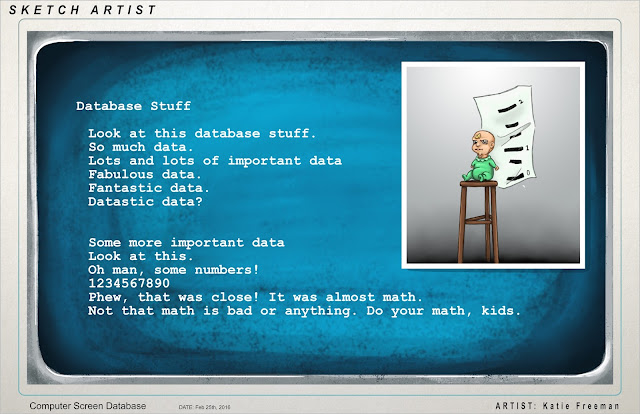
Here's the screen that pulls up when you select the computer at your Sketch Artist desk. Katie input some random text for now just to show what the font will be, but later this screen will look more refined and will sport real information about different cases in our game!

Here's an example of what our lineup screen will look like. When in the game, your first touch on the tablet's touchscreen will zoom you into the characters' faces so you can get a better look. At that point, your sketch that you drew will pop up!
After you think really hard on who you think is guilty of the crime, the player touches the screen a second time on the character. This selects them as the one you think is guilty! If you're correct, their silly mugshot will show up! Below is a conceptual design showing how the screen might be laid out for this part of the game:
Wednesday, February 24, 2016
More environment models and our first render test!
Our modeler Jose Morales has been hard at work on more models for our environment! On top of that, he lit the classroom, applied toon shaders, and pulled out an amazing first render pass. Our intention is to paint over the render image (our background will be static) in Photoshop to achieve any extra textured/painterly look we're aiming for, but with how great these renders are it won't take much to get there!
And here is the same render but with Capt. Walters in it to give us a better idea of how our 2D characters will look in a 3D environment! We'll add a stronger bottom shadow to characters in the final version because their shadows will be attached to the bottom of their "models" as a card.
And here is a WIP to show off more of the models that Jose has completed for us based on earlier office concept art. This will eventually be textured, lit, rendered, and then painted over in Photoshop!
Here's the render without Captain Walters in it:
And here is the same render but with Capt. Walters in it to give us a better idea of how our 2D characters will look in a 3D environment! We'll add a stronger bottom shadow to characters in the final version because their shadows will be attached to the bottom of their "models" as a card.
And here is a WIP to show off more of the models that Jose has completed for us based on earlier office concept art. This will eventually be textured, lit, rendered, and then painted over in Photoshop!
Some of Jose's models!
We are often asked how we intend to show our backgrounds and characters in engine, so we'll answer that question again in here along with many other technical answers!
Subscribe to:
Posts (Atom)


