Wednesday, August 17, 2016

Capstone is DONE!

Recently our team finished the game Sketch Artist and presented it at our final Capstone Presentations.

Below are video links to our presentation and some recorded gameplay!

Link to our presentation

Link to recorded gameplay

Also, here is an image of our final game poster by Katie Freeman, inspired by the art of the Pulp Fiction movie posters.


Sunday, March 6, 2016

Our Presentation is Over!

We missed this last Thursday's update on the blog, but for a good reason: We had our presentations to see what games might get cut!
Good news though, our game made it! We'll be continuing production on our game until it is complete and eventually published on the Apple apps marketplace. We don't know yet if we'll have any new additions to our art team, but there is a possibility our team might grow! We will find out Monday by the end of the day.

For our presentation, called Vertical Slice, we had to show a slice of the core gameplay of our game with no art allowed, then we had to give a separate art style guide presentation. Our producers and programmers worked long and hard on the gameplay section while our three artists, Katie Freeman, Jose Morales, and Kelly Rodak, worked on the style guide for the game's art. This style guide is what this blog has detailed the production of for the last couple of months! 

Our Art Lead Katie Freeman put together the presentation with all of our artists' work in it, and we'd like to share it with everyone! The images below is our style guide for the art of Sketch Artist.


Here's an animation test that our animator, Kelly Rodak, completed with an early version of the rig:


Here's a video example by Katie Freeman showing some of the UI elements moving around in her UI concept art piece before the slides afterward went into great detail:


Here's a gif of the effect in motion:


And that ended our art style guide! For our presentation, we had a Power Point version (with some stuff missing intentionally to keep it shorter) that Katie presented to the audience, and a printed version that was bound with metal rings and handed out to all of our art professors. It was a really tiring and stressful ordeal, but it really paid off in the end and we all feel that we have done our best! Sketch Artist has an amazing team and it will be exciting to see how our game continues to grow all the way up until publishing time! 

We will try to continue publishing updates in here, but some content in the future will be withheld with the intention of keeping some stuff a surprise for our players!

Thursday, February 25, 2016

More animation progress for moving graphic!

Kelly has made more progress on our moving graphic for our art presentation! We also have our 2D rig now, so Kelly worked on this in Maya!


Taking a shot at a logo design!

Designing a logo for a game is tough work! It's the image that is going to be the face of our team's hard work, so it's important that it is memorable and represents the game well. (And bonus points if it can be reworked into our app store icon, too!)

Here are designs by both Jose Morales and Katie Freeman for possible logos:


Fonts!

One thing we had to think about when designing our game was the sort of font we would like to see in the world, whether it be on stuff within the environment or written on a button. Katie Freeman designed two hand-drawn fonts for us to use since we felt it matched the Sketch Artist style! On top of that, we're using an Adobe font called Courier New Bold for the computer screen, which is the font visible in the interface design post on the computer screen concept.


Here are what our custom font designs look like!

This "handwriting" font is just a simple font meant to look like handwriting but still be neat and legible. It will be used for things in the game that are meant to look hand-written, and possibly for any menu stuff. We'll also be using this font in our Art Presentation for our big game presentation day!


This font is meant to be a little stiffer and more formal looking than the handwriting font above while still looking natural and hand-written. It has trouble showing up the inner shading once downloaded and installed though, so we'll have to work out how to fix that error.
This font will be used more for titling and labels. It could also be used within the world on any posters or signs.

Buttons and Interface!

We're getting deeper into the design of our game's many interfaces and buttons and what they'll look like. A lot of our buttons in the game are parts of the environment! Katie Freeman worked on the designs for the buttons and the design for the interfaces.


Let's take a look at our buttons first! Their functionality is briefly mentioned within the images:


Now let's take a look at some of these interfaces within the game!

Here's the screen that pulls up when you select the computer at your Sketch Artist desk. Katie input some random text for now just to show what the font will be, but later this screen will look more refined and will sport real information about different cases in our game!


Here's an example of what our lineup screen will look like. When in the game, your first touch on the tablet's touchscreen will zoom you into the characters' faces so you can get a better look. At that point, your sketch that you drew will pop up!


After you think really hard on who you think is guilty of the crime, the player touches the screen a second time on the character. This selects them as the one you think is guilty! If you're correct, their silly mugshot will show up! Below is a conceptual design showing how the screen might be laid out for this part of the game:


Wednesday, February 24, 2016

More environment models and our first render test!

Our modeler Jose Morales has been hard at work on more models for our environment! On top of that, he lit the classroom, applied toon shaders, and pulled out an amazing first render pass. Our intention is to paint over the render image (our background will be static) in Photoshop to achieve any extra textured/painterly look we're aiming for, but with how great these renders are it won't take much to get there!


Here's the render without Captain Walters in it:


And here is the same render but with Capt. Walters in it to give us a better idea of how our 2D characters will look in a 3D environment! We'll add a stronger bottom shadow to characters in the final version because their shadows will be attached to the bottom of their "models" as a card.


And here is a WIP to show off more of the models that Jose has completed for us based on earlier office concept art. This will eventually be textured, lit, rendered, and then painted over in Photoshop!

Some of Jose's models!


We are often asked how we intend to show our backgrounds and characters in engine, so we'll answer that question again in here along with many other technical answers! 

Technical decisions!

These decisions were in place before and have been mentioned in scattered posts across the blog, but we wanted to repeat some of the info in one place to better answer some of the questions we have been receiving lately! This doesn't cover everything, some stuff is still in its respective blog post from earlier, but if you have any other questions please feel free to comment in response to this post and we would love to answer them! We'll add all answers to this post so that everyone can see them!


Background

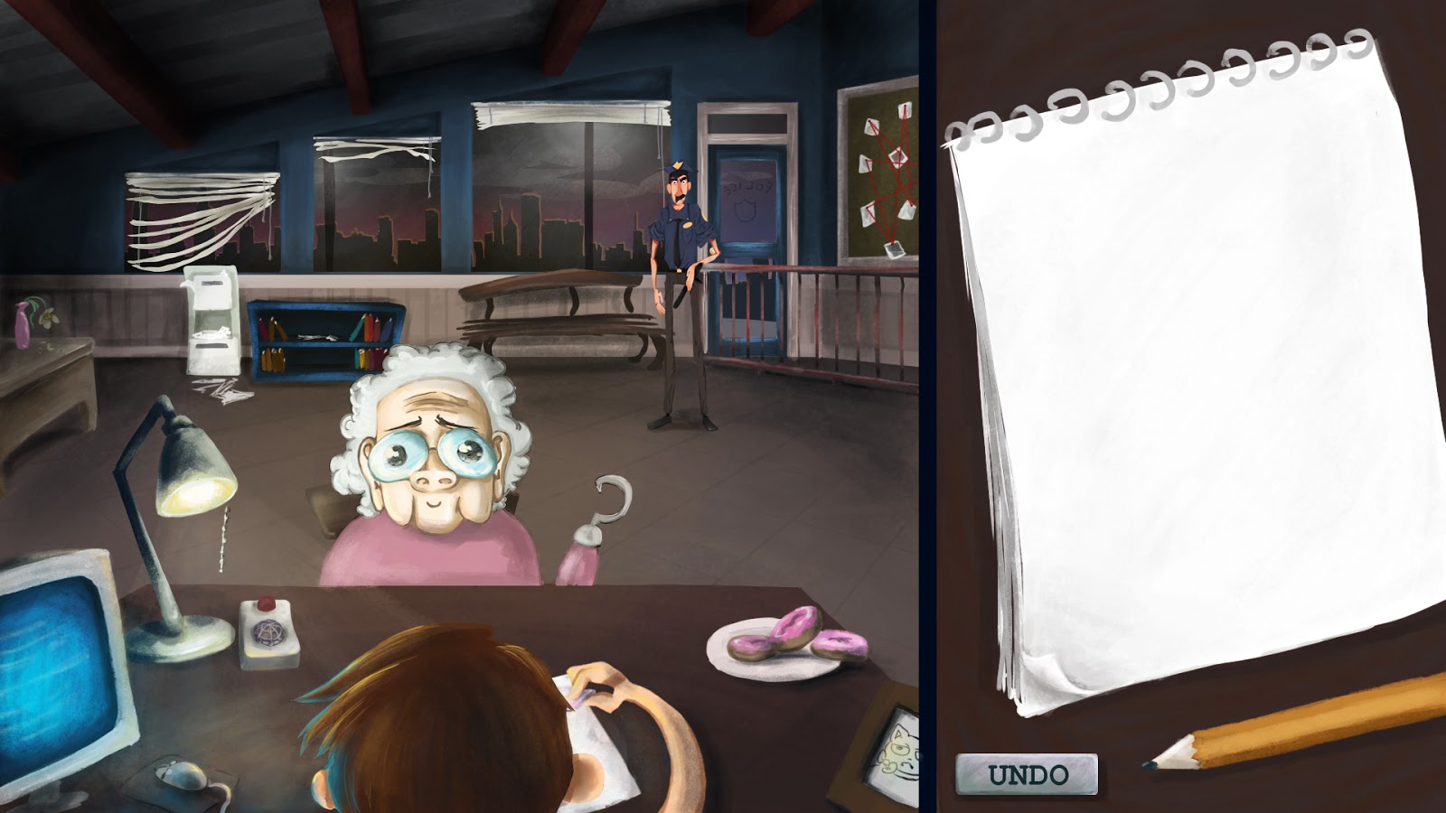
Our background will be rendered inside of Maya with as many polygons as needed for our modeler to get the environment looking awesome. This will be rendered out as a still image and painted over for any last edits. Then that last version will be saved out as a flat image that will be applied to a card inside of our game engine, Unity.  The camera will sit in a fixed position except for the zoom-in feature during the lineup phase. The 2D characters will sit in front of this backgroun card as their own "models", which will be 2D cards imported in with any animations (done in Maya) baked down into their bones.


Lighting

All lighting will be done in Maya before the environment image is rendered EXCEPT lighting of the characters. The characters will have their lighting (highlights and shadows) hand-drawn onto them during the design process using Photoshop. Then, in engine, they will have lights placed on them ONLY to get the cards to light up and be visible in the game. Any dramatic mood lighting will be hand-painted in beforehand. Our characters don't walk or have any position switches that would cause lighting to change. The only ones that will ever possibly move across the screen will be the distractions and they will be animated with After Effects and made into sprite cards, so while the lighting shouldn't change on them because we are purposely setting the lights in a way that it wouldn't feel necessary, they can easily be edited before the sprite sheet is applied in Unity.

We could explore lighting the characters in-engine later on after vertical slice (using things like lighting masks), but when considering requirements with the current art team that we have we made these technical decisions and goals in order to be realistic and put more focus in places where we really need it, such as making awesome and fun characters that will make everyone laugh!!

Characters' shadows will be attached to the rig as a card that has manipulators on it, allowing the animator to wiggle the shadow or stretch it if necessary. The only times we'll have characters with visible feet will be anything walking around in the back of the office, the lobby, and the lineup.
For both the office and lobby, the lighting will be in a way that the characters will all have their shadows mostly underneath them. This is done intentionally so that we don't have to worry about shadow perspective breaking our illusion of depth on the flat background card. The controllers on the shadow card attached to the rig will allow the animator freedom to move the shadow if the character picks up a foot to keep from breaking that illusion, but it will be very minimal shadow movement.
For the lineup, the characters will have their shadows dramatically cast onto the lineup wall using in-engine lighting. The characters will be painted for their own shadows and highlights in Photoshop, but then they will be front-lit to not only make the cards visible in Unity but also to get a dramatic backdrop shadow on our lineup wall.


Animation

All major animations will be done in Maya. Our interviewed characters will be animated, and we are reviewing and refining the animation style at the moment for something that better defines our wide spectrum of characters. Instead of focusing only on Tex Avery, we will select other styles to define the less-crazy characters.
The lineup characters will have an idle animation of a gentle swaying, which will be achieved using a simple rig of a single joint chain that has IK spline on it. This is just to allow a sort of breathing or swaying that adds depth and life to our lineup without adding too much extra work or too many extra assets. Characters in the lobby might also have this "idle" animation applied to them to give them life.
Characters in the lineup will NOT animate upon correct selection of the guilty perpetrator anymore. Instead, the screen will pull up their comical mugshot and a prompt that lets the player know that they chose correctly.
The "distractions" in the background of the office, where the interviews take place, will require very little animation, but those that do require animation will be animated in After Effects and applied in Unity as sprite sheets. Their animations will have very few frames, so there is no reason to apply a rig to each one. We can't use sprite sheets on the interviewed characters though because they will have very varied movement and it would include ridiculously massive sprite sheets.
The office itself will have a couple of animations to bring life to it. The flower in the background will drop a petal off every once in awhile as it withers away, a car might pass by outside the windows occasionally, maybe a mouse will skitter across the floor briefly (again, very few frames of animation). These animations will be applied using sprite sheets and they won't constantly be moving, they will work on separate timers to just occasionally do something to make it feel more alive in the environment and add depth.
The character in the office will have his arm wiggle when the player touches the touchpad to either draw or erase. This will be a comically simple animation where the arm itself does not bend but cartoonishly keeps its pose while just wiggling around. An example of this can be seen here.


Textures

We will be using toon shaders in Maya and then painting over the environment renders in Photoshop.


There are many technical decisions that we have made are still constantly making or updating! This post covers some of the biggest ones, but throughout the blog you'll find many more updates on decisions we have made regarding how we're going to accomplish certain art aspects of our game. And if you have any questions, please feel free to comment in response to this post and we'll add our answers into this post so everyone can see!

Thursday, February 18, 2016

Exploring Particle Effects!

Our game doesn't have many particle effects, but we did explore a stylized smoke poof in case we need one for our magician distraction! He has the ability to appear and disappear at will, so why not punctuate his appearances with a little poof of smoke?

Jose Morales made a first pass version of a smoke effect for us using Maya. It utilizes images that he hand drew for the particles so that we could maintain the style of our game's world. Check it out!


Animation Pose Exploration and Storyboarding Our Motion Graphic

Kelly Rodak did a storyboard for our moving graphic that we plan to have in our art presentation. It's going to be an animation of Captain Walters talking towards the audience, and will be the first animation done with a 2D rig for Sketch Artist! Right now we're only in the planning phase, but when the rig is ready to go she will be bringing Captain Walters to life! We might bring the timing down a bit though, at the moment we have 23 seconds of dialogue planned for the animation but we might aim for 15 seconds instead to be more realistic in what we can accomplish on top of all of our other work for Vertical Slice!


Here are also some still poses Kelly has been working on for Captain Walters:


For animations, we have also been discussing the Distractions mechanic and what all that will entail.. mostly art asset wise! We don't want to spoil what our designers are coming up with, but we do know that some of them will require animation. Our animator Kelly has decided that their animations will be done using sprite sheets after animating the 2D images in After Effects. This means we won't be rigging them like we are rigging our other characters for Maya animation! We didn't want to waste the time rigging such small assets that will barely have screen time.

Wednesday, February 17, 2016

First pass of lighting

Right now we are working on first passes of lighting tests, exploring different lighting possibilities and how to make everything look as aesthetically pleasing as possible. We're mapping out what we want by painting over environment concept art first, then we'll work inside of Maya to light our actual scenes for our rendered background images. The characters will have much of their lighting hand-painted into their colors, and then they'll be individually lit inside the game engine to create any character shadows we need.


For the office, we want emphasis on the interviewed character, but we also want the background to have lighting possibilities that can act light the lights of a theatre stage. As distractions or other mechanics occur in the background, different lights will be able to subtly turn up and light the area. Otherwise those areas will be slightly dimmed, giving our interview area and the desk the greatest amount of light, and the faint glow of the skyline through the windows.

Katie Freeman made edits on her office environment concept art to get an idea of what we will want to do in Maya for lighting.


For the debriefing room we plan to have it brightly lit like a classroom. 
Jose Morales did a quick layout using the props he has modeled so far, added area, directional, and point lights in Maya, then did a paintover in Photoshop to get a feel for the type of lighting we want to aim for. Take a look!


For the lineup phase, we met the challenge of wanting dramatic shadows on the back walls but not wanting dramatic shadows pulling down at the faces of our characters. To avoid this and get the look we want, the back wall will be lit in the game engine, then the 2D character cards will sit in front of it with enough distance that they aren't hit by the lights for the background (the lights will sit right up against the background card). Then they'll have their own light on their faces, simultaenously lighting them and creating the dramatic character shadows on the back wall.
Here's a screenshot from our original prototype showing the type of lighting we plan to accomplish:

Saturday, February 13, 2016

UI Design Example

We are continuing to design and add to the user interface based on what our Production Designers need! Here's a video by Katie Freeman showing some of the design ideas at the moment for the Office play screen (where you interview the characters before the lineup), along with some really basic movement to give an idea of how they might animate in the game.

The current design ideas include:

  • A moving arm when the player touches the sketch pad.
  • A pencil-eraser swap that includes a "button" of the tool that is not in use (so you can swap out again) in the sketch zone and the object in use shows up in the moving hand.
  • An undo button.
  • A bent corner of the sketch pad that can be tapped to reveal drawing guidelines for players who want more help when sketching.
  • A blinking red light on an intercom that will be used in the game for choosing your next person to interview.


These designs will continue to grow and evolve as our game makes progress!

Thursday, February 11, 2016

Animation study

Our animator Kelly Rodak is exploring lip sync animation and the mouth shapes she'll need! Here's a chart of visemes that are stylized in a way she thinks she would want for animating some characters. By exploring the needs for exaggerated shapes, we can better create a face rig for her that will meet her animation needs!


Below is a video of experimentation with lip sync. The character is 3D, but the experiment is just for Kelly to study what she needs for lip syncing since she has never done it before. She was having technical issues with Maya changing her timeline settings from 24 frames to 30 frames, so the timing might be a little off. We have to figure out what's causing these technical difficulties!


Models for our environments!

Our modeler Jose Morales has started designing and modeling the props that will fit in our environments! Our backgrounds will all be 3D with 2D characters over them. They'll be still-image renders so that Jose isn't limited in the amount of polygons he can use, despite us releasing on tablet! He is also exploring different options for shaders to get the base coloring down, making the paint-over process on the render a much faster and easier step. We want to keep the paint-over to be an enhancement and not depend on it for our source of textures.

Here are some of the models he has started so far, along with a couple of their UVs.


This one has the start of some shader research!


If you would like to watch one of the videos Jose is using for shaders research, you can find the Youtube video link below: