We're getting deeper into the design of our game's many interfaces and buttons and what they'll look like. A lot of our buttons in the game are parts of the environment! Katie Freeman worked on the designs for the buttons and the design for the interfaces.
Let's take a look at our buttons first! Their functionality is briefly mentioned within the images:
Now let's take a look at some of these interfaces within the game!
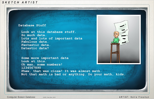
Here's the screen that pulls up when you select the computer at your Sketch Artist desk. Katie input some random text for now just to show what the font will be, but later this screen will look more refined and will sport real information about different cases in our game!

Here's an example of what our lineup screen will look like. When in the game, your first touch on the tablet's touchscreen will zoom you into the characters' faces so you can get a better look. At that point, your sketch that you drew will pop up!
After you think really hard on who you think is guilty of the crime, the player touches the screen a second time on the character. This selects them as the one you think is guilty! If you're correct, their silly mugshot will show up! Below is a conceptual design showing how the screen might be laid out for this part of the game:


No comments:
Post a Comment